What Net Promoter Score Loses by Collapsing the Top of the Rating Scale
Marcus Buckingham, in his May-June 2026 Harvard Business Review piece, did something most customer-experience and HR-tech vendors have spent twenty years not doing. He named Net Promoter Score as a problematic metric, in print, in HBR, on the way past it. The reason he gives is brief and easy to miss. He writes that someone who rates an experience 5 out of 5 has an altogether different experience of it than someone who rates it 4, that leaders should never collapse 4 and 5 into a single “percent favorable” bucket, and that NPS, by combining the top two scores on its scale, has the same problem.
That is a measurement-theory argument dressed in plain language, and it deserves a longer hearing than the parenthetical it gets in the article. The argument matters whether you run customer experience, employee engagement, candidate assessment, or any of the dashboards that report a single composite “satisfaction” or “promoter” number. What follows is what the argument actually says, why the people who built NPS made the choice they did, and what the alternative looks like when you take the construct seriously instead of the metric.
Table of Contents
- What NPS does mathematically
- The collapse step is the entire NPS critique argument
- Buckingham’s curvilinear claim, restated
- Why the top of a rating scale carries more information than the middle
- What proper rating-scale measurement looks like
- The structural cousin in employee engagement and the Q12
- What you actually do with this on Monday
- Where Buckingham’s argument stops short
- The discipline behind the critique
What NPS does mathematically
A Net Promoter Score takes a single eleven-point question (How likely are you to recommend this to a friend, on a 0-to-10 scale) and processes the answers in three steps. Respondents who answer 9 or 10 are coded promoters. Respondents who answer 7 or 8 are coded passives and dropped from the calculation. Respondents who answer 0 through 6 are coded detractors. The score is the percentage of promoters minus the percentage of detractors, a number that can range from minus one hundred to plus one hundred.
The first thing to notice about that procedure is how aggressive it is. Eleven response options get crushed into three bins, then one of the three bins is thrown away, then the remaining two get differenced into a single number. Out of all the information present in the raw response distribution, the final NPS preserves only the gap between the top-bin frequency and the bottom-bin frequency.
The second thing to notice is that the procedure is not a measurement. It is a summary of a measurement. The measurement is the eleven-point response. The summary is what most dashboards report, and the summary is the part Buckingham objects to.
The collapse step is the entire NPS critique argument
Suppose you run two surveys on identical samples of identical customers, and the only thing that changes between them is a real improvement in your service. In the first survey, your top-box responses are 30 percent 9s and 5 percent 10s. In the second, your top-box responses are 5 percent 9s and 30 percent 10s. The percentage of promoters is unchanged in both cases, 35 percent. The percentage of detractors has not moved. The NPS score is identical.
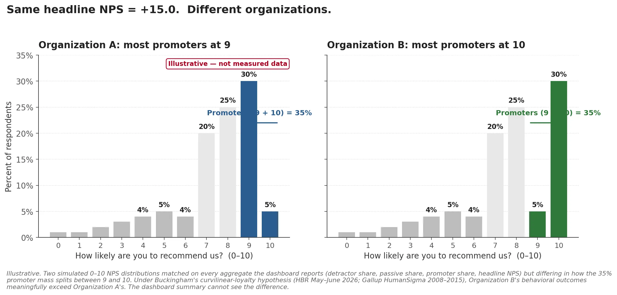
The chart above is illustrative, not measured data. Both panels are simulated to match the thought experiment exactly: identical detractor and passive distributions, identical 35 percent promoter total, identical headline NPS of plus fifteen, but the 35 percent promoter mass is split between 9 and 10 in opposite directions. The chart is what the response distribution actually looks like under the two regimes, and it makes the dashboard’s blind spot visible at a glance.
Something has changed. A meaningful share of customers moved from “extremely likely to recommend” to “as likely to recommend as anyone could be,” and that shift, on a curvilinear loyalty hypothesis, is exactly the place where revenue and word-of-mouth and retention actually move. The dashboard cannot see it. The collapse step has erased it.
The same arithmetic applies to a five-point Likert. If your engagement instrument reports the percentage of 4s-and-5s combined, you cannot distinguish a population that is heavily 4s with a few 5s from a population that is heavily 5s with a few 4s. Whatever follows from the difference, your dashboard does not know about it.
This is the point Buckingham was making. He was making it about customer-experience metrics specifically, but the form of the argument is general. Any metric that collapses the top of an ordered response scale is making an empirical bet that the differences within the top region do not predict outcomes. If that bet is wrong, the collapse loses information that would have been load-bearing.
Buckingham’s curvilinear claim, restated
The empirical bet, in Buckingham’s reading, is wrong. He cites Gallup’s HumanSigma meta-analysis, which pooled employee survey responses at scale (about 1.8 million respondents) alongside customer survey data roughly an order of magnitude larger, across the years 2008 through 2015, and points to a body of work outside that dataset, including Anderson and Mittal’s research on satisfaction and loyalty, with parallel patterns showing up in software-developer happiness and code quality, patient experiences and health outcomes, and student engagement and academic performance. Across these very different domains, the relationship between experience score and behavioral outcome is not a straight line. It is a hockey stick. Outcomes barely move as experiences improve from poor to mediocre to good. They start moving meaningfully only when experiences cross a high threshold and become extremely positive.
If the relationship between experience and outcome is curvilinear, the difference between a 4 and a 5, or between a 9 and a 10, is the part of the experience scale that carries the most behavioral signal. Collapsing those two response options into one bucket is not a tidy summary. It is a deletion of the signal-richest part of the data.
The curvilinear claim is the mechanism. Without it, NPS would be defensible as a fast pulse-check. With it, NPS systematically loses the differences that drive the outcomes the metric is supposed to predict.
Why the top of a rating scale carries more information than the middle
Psychometricians have a precise way of talking about this, which is worth borrowing because it makes Buckingham’s claim sharper than the curvilinear-graph framing alone.
When a person answers a Likert item, there is some latent trait the question is trying to measure, and the response options are step functions on that latent trait. Below the lowest threshold, the person picks 1. Between the first and second thresholds, they pick 2. And so on up to the top option. Inside item response theory (IRT), specifically the partial-credit and rating-scale models developed by Andrich, Masters, and others through the 1970s and 1980s, you can ask where on the latent trait each item is most informative. The answer is given by the item information function, and it is concentrated around the thresholds where respondents are switching between adjacent options. This is the part of measurement theory that classical test theory, with its reliance on raw aggregate scores and its assumption that response options are equally spaced on the trait, leaves on the table.
The implication for collapsed scales is direct. When you fuse the top two response options into a single “favorable” or “promoter” bucket, you delete the threshold between them. That threshold is exactly where the item is most informative for respondents in the upper region of the latent trait. It is the part of the scale where you have the best resolution on the people who are most likely to actually change behavior. You can run a test information function on most well-built engagement or customer-experience instruments and see this pattern numerically. The peak of measurement precision sits at the high end. The collapse step throws out the peak.
I walked through a concrete version of this argument in my post on item analysis in university exams, where the test information function showed where on the ability scale a thirty-item exam actually measured precisely. The same machinery applies to a five-point engagement Likert or an eleven-point recommendation question. The question is always: where on the latent construct is your instrument most informative, and is the metric you report preserving that information or averaging it away.
What proper rating-scale measurement looks like
The standard alternatives to a collapsed-percentage metric are not exotic. They are the default in any psychometric workflow that takes ordinal data seriously.
The first move is to keep the response distribution, not the summary. Report 5-out-of-5 separately from 4-out-of-5. Report 10-out-of-10 separately from 9-out-of-10. If you must produce a single dashboard number, make it the top-box frequency, not the top-two-box frequency. Top-box correlates with outcome under the curvilinear hypothesis in a way that top-two-box does not.
The second move is to model the response process directly. Andrich’s rating-scale model treats each Likert item as a set of ordered category thresholds and estimates respondent positions on the latent trait jointly with item parameters. Masters’ partial-credit model does the same when the threshold spacing varies across items. Both produce a person-level latent score that is a proper measurement, in the sense that it preserves the information in the original response distribution and lets you ask how much measurement precision you have at any point on the scale.
The third move, when you have a multi-item instrument, is to evaluate it as an instrument. Run the test information function and ask whether your items are densely informative in the part of the trait distribution where your respondents actually live. If your respondent population is concentrated in the upper region of the latent trait, which is normally the case for surveys of customers and employees who chose to answer, your items had better be informative up there. Many off-the-shelf instruments are built to discriminate among the population middle, and lose precision at the top. Reporting top-box separately is the cheapest way to get visibility into a region of the trait the instrument was not designed to resolve.
None of this is a critique of NPS for being simple. Simple is fine. The critique is that the procedure NPS uses to get to its single number throws away the data that the curvilinear evidence says matters most.
The structural cousin in employee engagement and the Q12
I made the same form of argument from a different angle in my post on measuring employee engagement when Gallup’s numbers don’t fit your org. Gallup’s Q12 instrument reports composite scores that mix engagement-as-outcome with engagement-as-antecedent, and presents the result as a population-level “percent engaged” benchmark. The mix collapses construct distinctions that matter for diagnosing your own organization. The dashboard says everything is fine, or everything is dire, on the same number that is doing several different jobs at once. The same logic shows up in the related construct-vs-scale critique I made about three popular leadership constructs and their actual instruments, and in the leader-trait piece on tolerance for ambiguity, locus of control, and what these scales actually measure.
The Q12 story and the NPS story are the same shape. Both metrics started life as serviceable aggregations of richer underlying response data, both rely on self-report that runs into response bias and social desirability bias in operational deployments, and both spread through the corporate dashboard ecosystem because their summaries were portable, comparable across organizations, and easy to chart. Both lose information at the construct level in ways that mostly do not bite for benchmarking but do bite for any organization trying to understand what is happening with its own people or customers.
When you sit with this for a while, the pattern is not really about NPS or Q12. It is about how composite scores accumulate authority faster than they accumulate construct validation. By the time enough leaders are tracking a number, the number has cultural weight that exceeds its measurement-theoretic weight, and questioning it becomes a posture rather than an analysis. Buckingham’s contribution is to hold the question open in a venue that gives it air.
What you actually do with this on Monday
For a customer-experience or product team, the practical sequence is short. First, look at the distribution under your NPS, not just the score. If you have the raw 0-10 response data, plot the full histogram. Watch where the mass actually sits. The dashboard summary is going to keep looking like the same number while the distribution shifts in ways that predict next quarter’s behavior.
Second, separate the top-box. Track 10-out-of-10 as its own line, not pooled into “promoters.” If your service designers run an experiment that moves customers from 9 to 10, you want to be able to see that movement before the marketing team explains why the unchanged composite means nothing happened.
Third, when you redesign your survey, ask whether eleven response options are doing useful work at the top end. There is a defensible argument for a longer scale precisely because it gives respondents room to differentiate between extremely-positive and almost-extremely-positive. There is also a defensible argument for a shorter scale with a thoughtful anchoring that forces a choice. The decision should be evidence-based on your own respondent population.
For an HR or people-analytics team, the moves are parallel. Stop reporting “percent favorable” combined buckets on engagement surveys. Pull the response distribution. Run an item analysis on your composite to see whether your items are actually informative in the part of the trait distribution where your population sits. If your engagement instrument is off the shelf, ask the vendor for the test information function on their normative sample. If they do not have one, that is a useful signal about how seriously they take the construct.
For an assessment or selection team, the move is the most direct. You probably already work with proper rating-scale models, and the question is whether your downstream dashboards expose the underlying measurement precision or report a collapsed pass-fail or quartile that throws it away.
Where Buckingham’s argument stops short
The curvilinear claim is empirical, and like any empirical claim it can fail to hold for a particular organization or product. The HumanSigma evidence comes from large pooled datasets that average across many companies and many customer relationships, and the result might wash out a lot of organization-specific structure. In a particular B2B SaaS context, or a particular healthcare network, the experience-to-outcome curve might be approximately linear across the working range, in which case collapsing the top of the scale loses less than the curvilinear hypothesis predicts.
The way you find out is to fit the model on your own data. Run the regression of customer behavior on the full ordinal response, with a flexible functional form, and see whether the slope between 4 and 5 is steeper than the slope between 3 and 4. If it is, Buckingham’s argument applies to your case. If it is not, you have learned something specific about your own organization that lets you decide whether the cost of preserving the response distribution is worth it.
This is a construct-validity question dressed in a metrics question. The construct (loyalty, satisfaction, engagement) is theoretical; the metric (NPS, top-box, percent favorable) is the observable. Whether the metric measures the construct in your particular case is exactly what construct validity asks, and it is what the diagnostic above gives you. Population-level claims pooled across hundreds of organizations cannot answer it for you.
This is the move Buckingham does not show in the article. He gives you the population-level claim and the case studies. He does not give you the diagnostic for your own organization. Filling that gap is where the work is.
The other limit of the argument is that any single-question metric, however well scaled, is doing far less work than a multi-item instrument. NPS replaced richer customer-satisfaction batteries because it was faster to run, not because it measured the construct better. The full critique of NPS includes the construct-coverage critique, the willingness-to-recommend-as-imperfect-proxy-for-loyalty critique, and the mode-of-administration critique. Buckingham’s collapse-step argument is one piece of the larger case. Treat it that way.
The discipline behind the critique
The reason I find Buckingham’s parenthetical worth two thousand words is that the discipline behind it is the same discipline that distinguishes assessment work that holds up from assessment work that does not. When you build an instrument to measure a construct, you have to know what your items are measuring, where on the trait distribution they are precise, what response process generated each answer, and what your aggregation procedure preserves and discards. Most workplace metrics dashboards skip every one of those questions and arrive at a number that looks comparable to the number a different organization arrived at. The numbers are comparable because they were processed the same way. They are not comparable in the deeper sense that they reflect the same underlying construct measured with the same precision in both places.
Buckingham is not saying NPS is useless. He is saying that the procedure NPS uses to arrive at its summary deletes the part of the data that drives the outcomes NPS is supposed to predict. The cure is not to abandon the metric. The cure is to look at the data underneath it, separately, with the assumption that the top of the scale carries more information than the dashboard is letting it carry.
That is a small move. It is also the move most teams have not been making, because the dashboard summary feels like the point. The summary is a compression. The compression is a choice. Buckingham named the choice. The work is to act on it.
Related reading
Discriminant Validity in Practice: How to Tell a New Construct From a Renamed One
Trust ambiguity, grit, and the test that separates a real construct from a relabel. Convergent and discriminant validity in practice, with a worked example.
Tolerance for Ambiguity, Locus of Control, and What These Leader Traits Actually Measure
Two HBR articles invoke leader traits as advice. The scales exist: IUS-12, tolerance for ambiguity, locus of control. What they actually predict for executives.
Three Popular Leadership Constructs Through the Lens of Their Actual Scales
Wise empathy SJT, Edmondson's psychological safety scale in human-AI teams, and the contested ALQ. What three leadership constructs actually measure.
Custom or Off-the-Shelf Psychometric Instrument?
When does a custom psychometric instrument earn its multi-week build cycle, and when is off-the-shelf personality assessment for hiring enough?