What Psychometric Analysis Reveals About University Exams (Real CTT and IRT Findings)
On a 30-item university exam, one question was answered correctly by 93% of students. That sounds like a well-aimed item, maybe slightly on the easy side. The classical item statistics told a more ambiguous story. The item-total correlation was 0.35, which is acceptable. One of the four options had been picked by fewer than 2% of students. The question was, in effect, a three-option question wearing a four-option mask. The 93% success rate wasn’t evidence of clarity. It was partly the byproduct of a distractor that was never in the running.
Neither signal, taken alone, crossed the usual thresholds. The p-value was under 0.95. The item-total r was above 0.20. Only one distractor was dead. Every rule I’d written for classifying items worst-issue-wins skipped past it. It took a compound rule, added after feedback from the dean reviewing the report, to catch the pattern: when an item sits at p ≥ 0.90 and at least one distractor is dead, the easiness is partly structural, not purely substantive. The fix is cheap. Rewrite the vestigial option. The fact that I almost missed it is the point of this post.
I built a reproducible CTT + IRT pipeline for psychology exams at my University. The interesting part isn’t the pipeline. It’s what came out the other end. Some of the findings were the kind of thing any psychometrics textbook prepares you for. Others were quieter patterns that only surface when you look at the response data with the right instruments pointed at it. This post is about those findings, what I think they imply for academic assessment, and where the visuals make the story impossible to ignore.
Table of Contents
- What CTT and IRT Actually Tell You
- The Item Quality Map: Difficulty and Discrimination at a Glance
- The Quiet Tell: Distractor Adjacency in Multiple-Choice Items
- Negatively Discriminating Items
- Where the Test Actually Sits: the Wright Map
- Where the Test Measures Precisely: the Test Information Function
- When the 3PL IRT Model Refuses to Cooperate
- Dead Distractors: Distractor Analysis as the Cheapest Possible Fix
- Unidimensionality and the Items That Lean on Each Other
- SEM-Aware Pass/Fail: the Number the Committee Actually Cares About
- Describe, Don’t Diagnose: How a Psychometric Report Lands
- What This Means for Academic Assessment
What CTT and IRT Actually Tell You
A short refresher, because this is where most explanations overshoot or undershoot their reader.
Classical Test Theory operates on raw scores. It gives you, per item, the proportion of students who got it right (the p-value, or difficulty), and the correlation between getting that item right and the total score on the rest of the test (the item-total r, or discrimination). It gives you, per test, a reliability coefficient like KR-20, which answers “if this same group of students took a parallel version of this test, how consistent would their ranking be?”. KR-20 ranges from 0 to 1. Above 0.80 is good for high-stakes tests. Below 0.60 starts to mean the test is noisy enough that small changes in score reflect measurement error more than ability.
Item Response Theory models the probability of a correct answer as a function of a latent ability parameter, usually called θ. The 2PL model estimates two things per item: difficulty (b), the θ value at which a student has a 50% chance of getting it right, and discrimination (a), how sharply that probability climbs as θ increases. A 3PL model adds a guessing parameter (c), the floor probability of a correct answer for a very low-ability student. On a four-option multiple-choice test, c should sit near 0.25 if students are guessing randomly when they don’t know.
CTT is easy to compute and easy to interpret. IRT is harder to fit and requires more data, but it separates item properties from the ability distribution of the specific cohort that sat the test, which is what you want when you’re building a durable item bank. Used together, they catch different things. The interesting work is in the overlap.
The Item Quality Map: Difficulty and Discrimination at a Glance
The single most compact way to read an exam is to plot every item as a point in (p, r) space: difficulty on the x-axis, item-total correlation on the y-axis. The “good zone” is a rectangle: items that fall inside 0.30 < p < 0.85 with r > 0.20 are doing their job. Items outside that rectangle have something to explain.
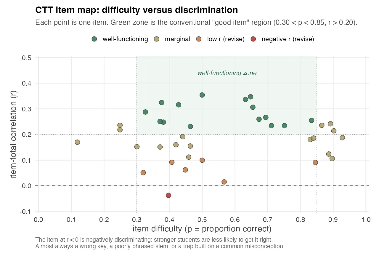
The chart above is from one exam in the pipeline. Each point is one canonical item. Five buckets:
- Well-functioning items sit inside the green rectangle. About 40% of the items. These do real measurement work.
- Marginal items have r between 0.10 and 0.20, or p in the 0.85–0.95 range. They aren’t broken, they’re just not contributing much to reliability. Most exam banks have a lot of these.
- Low-r (revise) items have item-total correlation below 0.10. Students who got them right were almost indistinguishable from students who got them wrong on every other item. The item is noise.
- Extreme-p items are either trivially easy (p ≥ 0.95) or effectively unanswerable (p ≤ 0.05). Both waste a question slot.
- Negative-r items are the most actionable single finding in the whole analysis. See below.
The visual clustering on the right side of the chart, most items at p > 0.7, most item-total correlations between 0.15 and 0.30, is the same finding you’ll see later in the Wright map, from a different angle. The exam is easier than the cohort, and easier items give you less room for strong discrimination. That’s not a coincidence. The mathematics of CTT says an item can only discriminate maximally when its p is near 0.5, because that’s where variance in the raw score is largest.
The Quiet Tell: Distractor Adjacency in Multiple-Choice Items
The most interesting finding I wasn’t looking for surfaced when I computed the wrong-answer distribution conditional on the letter of the correct answer. The null hypothesis, if a test is well-written, is that when students miss an item they spread their wrong answers roughly evenly across the other three options, about 33% each. Deviations from that are informative.
The matrix looked like this (representative numbers from the analysis):
| Correct letter | A picked | B picked | C picked | D picked |
|---|---|---|---|---|
| A | — | 48% | 27% | 25% |
| B | 51% | — | 26% | 23% |
| C | 22% | 24% | — | 54% |
| D | 24% | 25% | 51% | — |
Read across any row and you see the same pattern. When the correct answer is A, wrong students overwhelmingly pick B. When it’s B, they pick A. The C–D pair shows the same coupling in the other direction. The diagonal neighbors dominate in a way that can’t be random.
There are two explanations, and they aren’t mutually exclusive. The first is that the item author, consciously or not, writes items in a way that places the most plausible distractor adjacent to the correct answer in the option list. This is consistent with good item-writing practice (every question should have one strong competitor to the correct answer), but the placement is a tell. The second is that students who are uncertain between two plausible options default to an adjacent letter when they can’t distinguish.
Either way, the structural pattern leaks information. A clever student who has studied the exam’s history knows that when they’re torn between two options, those options are probably adjacent. The fix is structural: write the stem first, write the best distractor second, and then randomize the option order. Most item banks get the first two steps right and skip the third.
This isn’t a finding about the exam author’s competence. It’s a finding about what happens at the level of an item bank when everyone is doing their best work and nobody is running this particular cross-tabulation. The pattern only becomes visible when you pivot thousands of wrong answers by the letter of the correct response.
Negatively Discriminating Items
A negatively discriminating item is one where stronger students are less likely to answer correctly than weaker ones. It’s the dot below the horizontal line in the CTT item map above. A negative item-total r is almost never a real phenomenon about the subject matter. It almost always means one of three things:
- The answer key is wrong.
- The correct answer is technically right, but the item has two defensible readings, and stronger students are more likely to read it the “wrong” way.
- The question is testing a common misconception, and students who studied enough to absorb the misconception are getting it wrong while students who guessed blindly are getting it right.
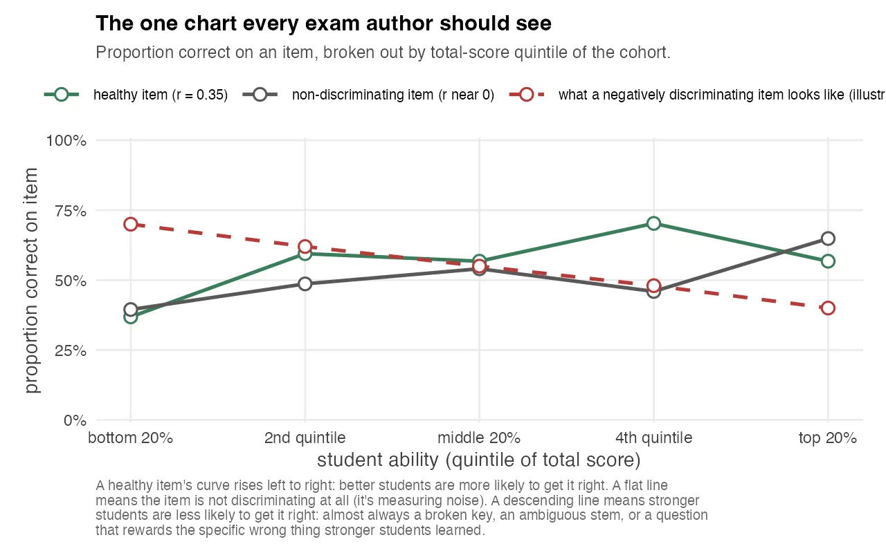
The chart above is the simplest version of the idea. Split the cohort into five ability groups by total score, and for any single item, plot the proportion of students in each group who got it right. A healthy item’s curve rises left to right. A flat line means the item is noise. It doesn’t distinguish anyone. A descending line is the negatively discriminating case, and the dashed red reference shows what it looks like when an item is sharply inverted.
In a well-run item bank, a negatively discriminating item is the single most actionable signal you can get. You don’t need elaborate analysis to know what to do. You go back to the source, re-read the question, check the key, and either fix the wording or retire the item. It’s one of the few cases where a single statistic points directly at a single action, and the chart makes the finding impossible to explain away.
Where the Test Actually Sits: the Wright Map
The Wright map is a two-panel plot on a shared θ axis. The top panel is a histogram of student ability estimates from the IRT model. The bottom panel is a strip plot of item difficulties at their estimated b values. The whole story is in the alignment between the two panels.
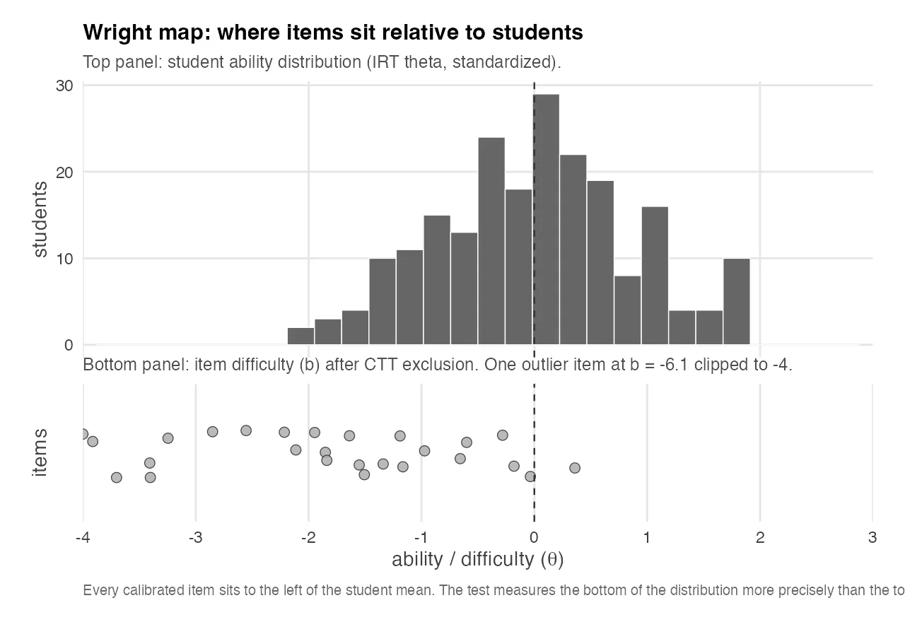
The top panel shows the student ability distribution, standardized by construction to mean 0. The bottom panel shows the items that survived CTT exclusion and were calibrated under the 2PL model. The item difficulty mean is around −1.9, with a tail stretching further left. One extreme outlier is clipped at −4 for readability.
The visual story is blunt. Every calibrated item sits to the left of the student mean. The test is systematically easier than the cohort it’s trying to measure. Most items max out their discriminating power at ability levels a full standard deviation or more below the median student, which means they contribute almost nothing to distinguishing between students in the upper half of the ability distribution, the half you usually care about most.
This is the most informative diagnostic you can give an exam author, and it doesn’t require them to know what IRT is. You hand them this chart, point at the gap, and say: your test is sitting to the left of your students. If you want the test to discriminate cleanly among the students who pass, you need more items at θ ≈ +0.5 to +1.5, material a median student gets right about half the time.
The related finding is counterintuitive: a test that is uniformly too easy produces low reliability. If most students pass most items, there isn’t much variance in the score for KR-20 to work with. Low reliability is often not a sign of a hard test. It’s often a sign of a test that can’t tell its own population apart.
Where the Test Measures Precisely: the Test Information Function
The Wright map shows what the test is measuring. The Test Information Function shows how precisely it measures at each level of ability. For a 2PL model, item information is I(θ) = a² · P(θ) · (1 − P(θ)), and test information is the sum across items. Precision and information are reciprocal: SEM(θ) = 1 / √I(θ). Wherever information is high, the ability estimate is tight. Wherever information collapses, the estimate is essentially a guess.
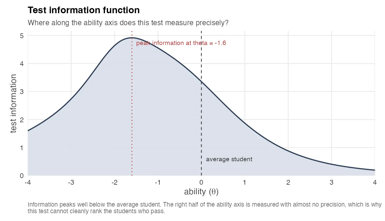
The chart shows the TIF for the same exam as the Wright map. The curve peaks at θ ≈ −1.6, well below the average student, and decays rapidly toward the upper half of the ability distribution. By θ = +1 the information has dropped to about a third of its peak, which on the raw score scale means the standard error of the ability estimate is nearly double what it is for a weak student.
This is the same “test too easy” finding as the Wright map, but expressed in a way that’s even more concrete: the curve says, in one glance, that this test cannot cleanly rank its strong students because it has almost no precision in the region where they live. Anything the instructor does to act on the TIF, adding harder items, removing trivial ones, rebalancing the bank, has a direct, computable effect on that curve. The TIF is one of the rare psychometric charts that doubles as a design tool.
When the 3PL IRT Model Refuses to Cooperate
One of the quieter findings in the analysis happens at the level of model selection. On a four-option multiple choice test, the 3PL model estimates a “guessing” parameter c per item. A reasonable value is around 0.25, matching the random-guessing floor on four options. Across the exams I analyzed, the 3PL fit kept producing c values that were clearly too high, in one case a maximum of 0.92. The pipeline rejects 3PL and falls back to 2PL whenever max(c) > 0.35.

The chart above shows what this looks like on a single item. Green is a well-behaved 2PL fit: students at very low ability have almost no chance of getting the item right, and the probability climbs smoothly as ability increases. Red is what the 3PL tries to do with the same item. Instead of modeling a real guessing floor near 25%, it parks the floor at 92%, essentially saying “I cannot locate a low-ability region for this item, so I’ll assume almost everyone gets it right.”
A 0.92 guessing floor isn’t a real guessing parameter. It’s the optimizer giving up. That happens when an item is so easy that it provides almost no information about ability anywhere in the relevant range, and the model, looking for somewhere to put the variance, parks it in c. The practical lesson: when your 3PL won’t converge on plausible guessing parameters, the problem isn’t usually with the model. It’s with the item bank. The model is telling you that some items are too easy to be modeled at all, which is exactly the same finding as the Wright map and the TIF, surfaced through a completely different mechanism.
I kept this finding in the technical report because it matters to psychometricians, and I kept the 3PL → 2PL fallback in the pipeline because the alternative was reporting implausible guessing parameters as if they were real. Both are forms of the same principle: when the statistics are telling you the same story three different ways, believe them.
Dead Distractors: Distractor Analysis as the Cheapest Possible Fix
A “dead distractor” is a wrong-answer option chosen by fewer than 2% of test-takers. It’s dead in the sense that it’s not doing any work. For every dead distractor on a four-option question, the test is effectively a three-option question for most practical purposes, which raises the floor probability of a correct guess from 25% to 33%.
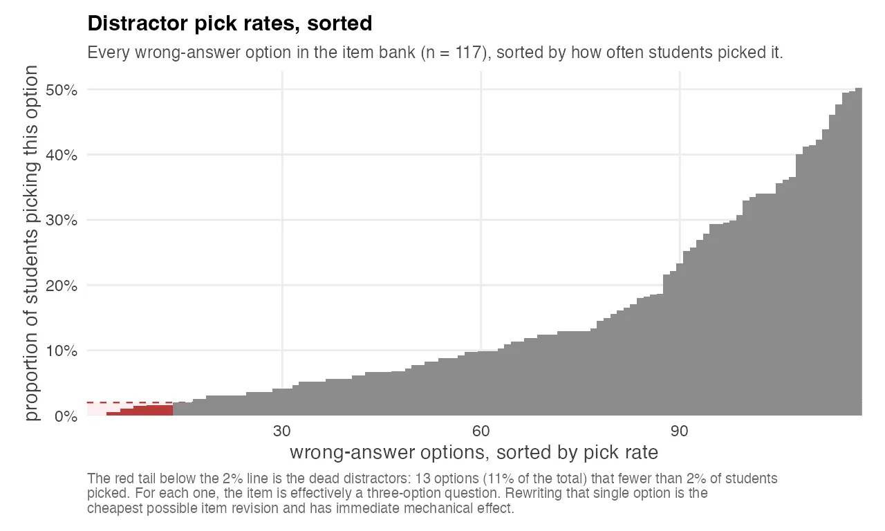
The chart above plots every wrong-answer option in one exam’s bank, sorted by how often students picked it. The shape is informative by itself: most distractors cluster between 10% and 30% of wrong picks, but there’s a clear tail below the 2% line, those are the dead options. On this exam, about one in nine wrong options was dead, which meant 13 items out of 39 had at least one vestigial distractor.
The mechanical implication is boring: an exam with a lot of dead distractors is slightly less informative than the raw statistics suggest. The practical implication is more interesting.
Dead distractors are the cheapest possible revision. The item stem is already written. The correct answer is already validated. The three live distractors are already calibrated. All the author has to do is rewrite one wrong option, the one nobody picked, and the item improves immediately. Most item-revision work at universities happens at the level of the whole question, because that’s how exam committees think. Dead-distractor analysis surfaces the minimum-viable edit, and it surfaces it automatically, with no judgment call about what to rewrite.
Unidimensionality and the Items That Lean on Each Other
IRT models built on a single ability parameter assume the test measures one underlying construct. If that assumption is violated, if the test is secretly measuring two or three different things, the parameter estimates become a compromise between factors, and the Wright map and TIF stop being honest about what’s happening.
The usual check is to eigendecompose a tetrachoric correlation matrix of the items and look at where the eigenvalues drop.
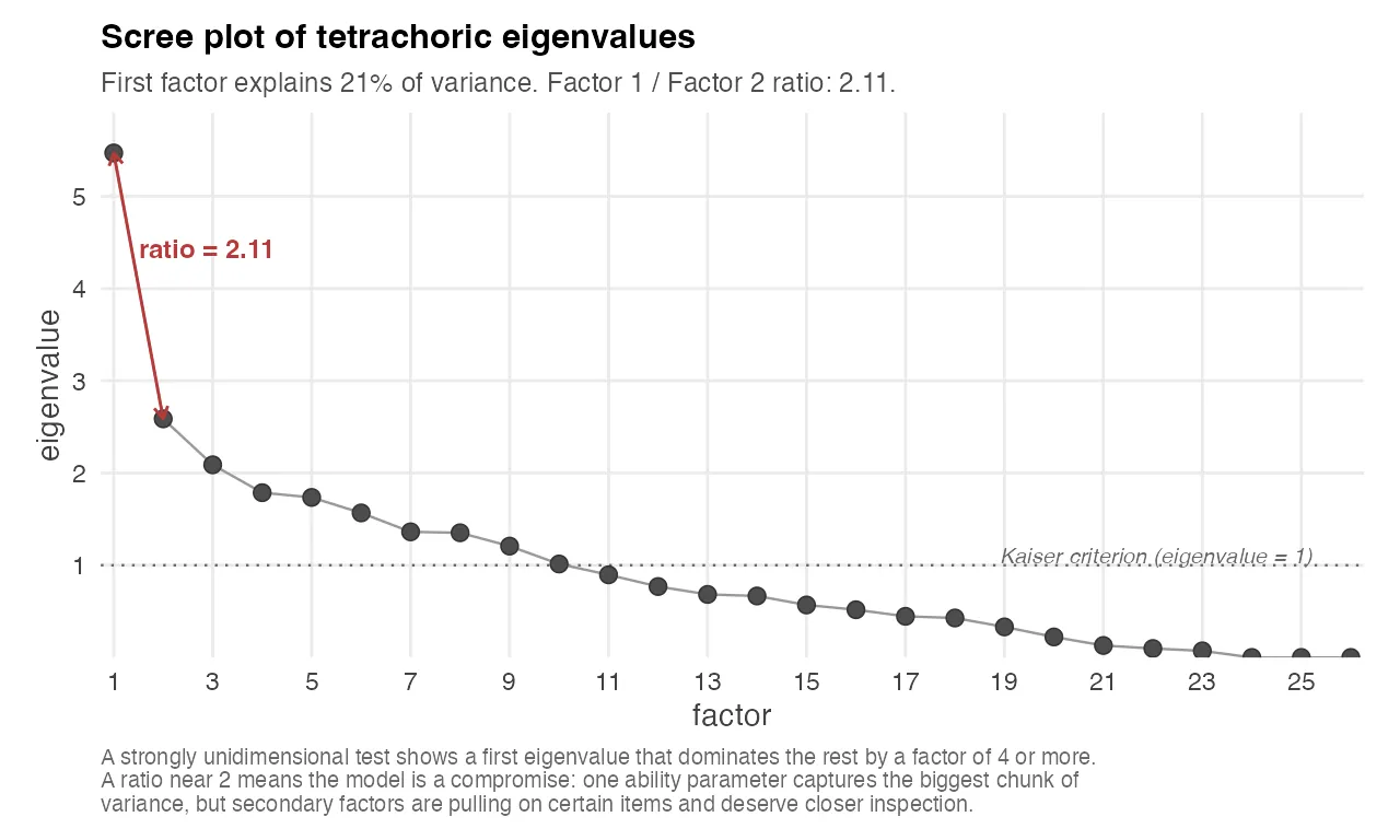
The chart above shows the eigenvalues of the tetrachoric correlation matrix for one exam. The first eigenvalue is the variance explained by the single best factor, the second is what’s left for the second best factor, and so on. A strongly unidimensional test has a first eigenvalue that dominates the rest by a factor of four or more. On this exam the ratio is 2.11, and the first factor explains only about 21% of the total variance. That’s borderline: you can still fit a unidimensional IRT model and get interpretable parameters, but the model is making a compromise, and the residual second and third factors are pulling on certain items harder than others.
The related diagnostic is Yen’s Q3 statistic: for each pair of items, how much residual correlation remains after accounting for the single ability parameter? High Q3 values flag pairs of items that share variance beyond what the model predicts. The usual causes are content overlap (two items testing the same micro-concept, so knowing one tells you the other), contextual dependence (one item’s stem references information from another), or shared testlet structure (items grouped under the same passage or prompt).
None of this is visible in raw CTT statistics. It only appears once you’ve fit the IRT model and looked at what’s left over. The actionable output is a small list of item pairs that should be inspected for redundancy. In a well-curated item bank, that list gets shorter every round.
SEM-Aware Pass/Fail: the Number the Committee Actually Cares About
Every exam quality committee has the same question, eventually: “how many students were wrongly graded?” Nobody asks it in those words, because nobody wants to know the answer if the answer is “a lot”. But it’s the question underneath every appeal, every re-grade request, every faculty meeting about standards.
The psychometric answer is unsatisfying but honest: a raw score is an estimate of true ability, and the estimate has a standard error of measurement. For a 40-item test with KR-20 = 0.69, the SEM on the raw-score scale is about 2.7 points. Any student whose observed score is within ±1 SEM of the cutoff is in a band where a parallel version of the same test could plausibly flip them in either direction.
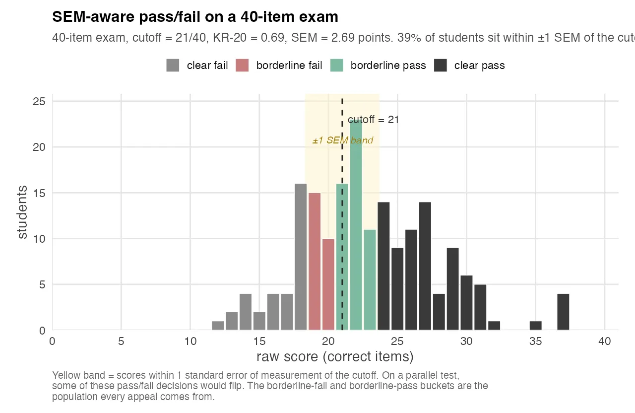
The chart above shows the raw-score distribution for one exam. Students are binned into four groups: clear pass, borderline pass (raw score between the cutoff and cutoff + 1 SEM), borderline fail (raw score between cutoff − 1 SEM and cutoff), and clear fail. The yellow band marks the ±1 SEM window.
About 39% of the cohort sits inside the yellow band. That’s not an indictment of the test. Measurement error is a property of any psychometric instrument. But it’s the number a quality committee should hear, because it tells them something concrete: on this test, with this reliability, the pass/fail decision for roughly two out of five students is partly made by noise.
The solution isn’t to lower the cutoff or invalidate the exam. It’s to either raise the reliability of the instrument through the other analyses in this post, or acknowledge in advance that a band of scores sits inside the error bar and build an explicit policy for handling them. Either approach is defensible. Ignoring the error bar is not.
Describe, Don’t Diagnose: How a Psychometric Report Lands
I built the first version of these reports as diagnostic audits. For each item, a verdict: keep, revise, retire, anchor. For each exam, a summary of weaknesses. For each author, a list of recommendations. They were psychometrically correct and politically radioactive.
Stakeholders flagged this before any report went out. An audit-style report, read by an exam author who has been writing their course exams for fifteen years, lands as an attack on their competence. The recommended changes would never happen, because the emotional cost of acknowledging them was higher than the cost of a slightly noisier test.
So I rewrote the entire reporting layer around one rule: the reports describe the data, they don’t diagnose the author. Every threshold names its literature baseline. Every deviation from that baseline is described as a property of the item, never as a property of the item-writer. Recommended revisions are framed as “directions to consider”, not prescriptions. There’s no red/yellow/green color coding. The categories have neutral names and no celebratory language. A well-calibrated item is “good item”, which is descriptive. A problem item is “for revision”, which is descriptive. Neither word is praise or blame.
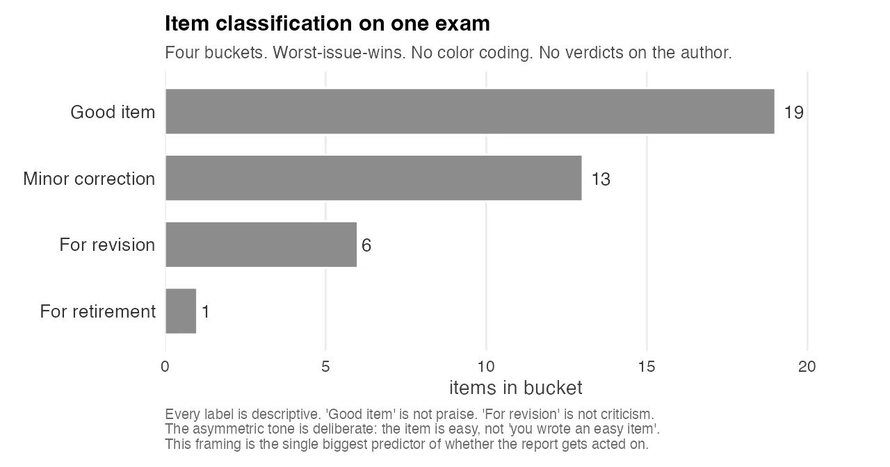
The chart above is what the category distribution looks like on one exam. Four buckets, worst-issue-wins, all in the same grey. No red bars. No green bars. No “congratulations” header on the good pile and no “warning” header on the revision pile. The chart is the design choice: every visual cue that would have encoded a judgment on the author has been stripped out, and what remains is a count of items in each descriptive category. The author can look at the chart and see how much revision work is in front of them without being told they failed at anything.
This was a harder problem than any of the statistics. It took several iterations and several rewrites. The final version has essentially the same analytical content as the first draft, but the prose was engineered to keep authors reading long enough to reach the actionable parts. The asymmetric tone is deliberate: “the item is easy”, never “you wrote an easy item”. The test has problems. The test author has information.
I’ve come to believe that this framing is the actual deliverable. The statistics can be computed by any trained psychometrician with a week of R. The willingness to ingest the results and change an item is what makes a quality improvement cycle work, and you don’t get that willingness from a technically correct report that makes the recipient feel audited.
What This Means for Academic Assessment
Three things, in increasing order of how strongly I believe them.
First, almost every university multiple-choice exam I’ve looked at has structural problems that the people grading it cannot see without running this kind of analysis. That’s not a criticism of anyone. It’s a consequence of the fact that item-writing is traditionally evaluated by content experts, not psychometricians, and the two roles ask different questions of the same data. Content experts ask “is this question fair and on-topic?”. Psychometricians ask “is this question discriminating between students who know the material and students who don’t?”. Both questions matter. Most exams are evaluated on the first one only.
Second, the barrier to running a proper psychometric pipeline has collapsed. Everything in this post runs on open-source tooling (mirt for IRT, psych for tetrachoric correlations, Quarto for reporting), and the whole pipeline produces its output in minutes per exam. The bottleneck is not the statistics. The bottleneck is getting exam authors to share their response data and to take the findings seriously, which is a question about institutional culture, not software.
Third, and most strongly: if you run a program that administers high-stakes assessments, like professional certifications, university admissions tests, medical licensing, or psychometric screening, the difference between your current instrument and a properly analyzed one is almost always in the tail of the score distribution. It’s not visible in the means. It’s visible in exactly the students whose pass/fail decision was closest to the cutoff. That’s the population every appeal comes from, and it’s the population every analysis in this post is aimed at.
If you’re building or maintaining an assessment program and the words “item response theory” have never come up in a faculty meeting, that’s not a scandal. It’s an opportunity. The analyses are cheaper than you think. The findings are more concrete than you expect. And the hardest part of the whole project, by far, is the part where you learn to describe the data without making anyone feel accused.